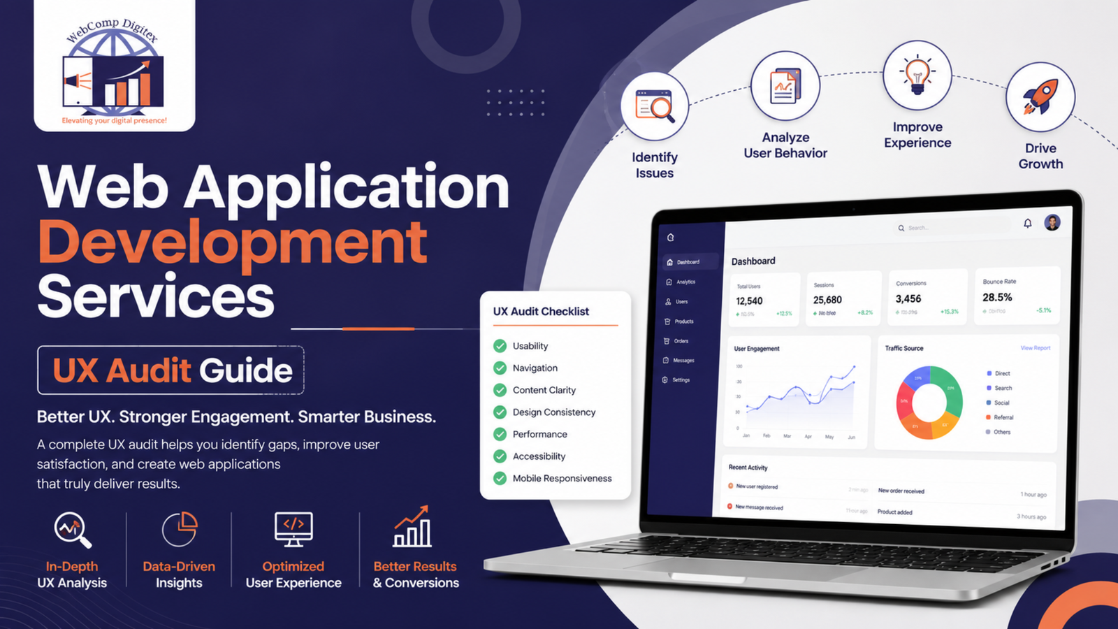
How Web Application Development Services Fix UX Issues That Kill Your Conversions
Your website looks good. You paid good money for it. But users aren’t converting.
They’re landing on your homepage, clicking around for 20 seconds, and leaving. Your bounce rate’s sitting at 68%. Form submissions are trickling in at maybe 2-3 per week when you need 20. And you’re wondering if it’s your ads, your offer, or just bad luck.
It’s probably none of those. It’s UX.
Here’s the thing: most websites built for Indian SMBs look fine in screenshots but fail the moment a real user tries to actually do something. The contact form’s buried. The mobile menu doesn’t work right. Load time on 4G is brutal. And nobody’s telling you because they just leave instead.
I’ve spent 12 years auditing websites for businesses across Pune — from manufacturing units in Chakan to real estate developers in Baner. The issues are almost always the same. And they’re fixable.
Let me walk you through exactly how to audit your website for UX issues. Not the theoretical stuff. The actual process that a good web app design agency would use.

Start With Real User Behavior, Not Your Gut
Don’t guess. Look at data first.
Install Hotjar or Microsoft Clarity if you haven’t already. Both have free tiers. Set them up and wait 7-10 days to collect session recordings and heatmaps. This is non-negotiable. You need to see what real users are actually doing, not what you think they’re doing.
Watch 20-30 session recordings. I mean actually sit down and watch them. You’ll feel uncomfortable seeing people struggle with your site. That discomfort is useful.
Here’s what you’re looking for:
Rage clicks — when someone clicks the same element 5-6 times because they expect it to do something and it doesn’t. I audited a healthcare client’s site in Kharadi last year. Their “Book Appointment” button on mobile had rage clicks on 40% of sessions. Know why? The button looked clickable but was actually just an image. Not linked to anything. They’d been running ads to that page for 8 months.
Dead-end pages — users land, scroll a bit, then exit without any interaction. Check your exit rates in GA4 by page. If a page has over 60% exit rate and it’s not a “Thank You” page, something’s broken. Either the content doesn’t match what they expected, or there’s no clear next step.
Form abandonment spots — watch where people start filling your contact form then stop. Usually it’s at phone number fields (people don’t want to give it), or right before submit (they don’t trust you yet). A real estate developer we worked with in Wakad had 73% form abandonment. We watched recordings. People filled everything, then saw the submit button said “Submit & Talk to Sales Executive Immediately” and bailed. Changed it to “View Floor Plans” and abandonment dropped to 34%.
Look, I’m not saying Hotjar solves everything. But you can’t fix what you can’t see.
Audit Your Mobile Experience Separately (It’s Probably Worse Than You Think)
Most business owners test their website on their laptop. That’s a mistake.
In India, 65-75% of your traffic is mobile. For some industries it’s 85%. And mobile users aren’t just “desktop users on a smaller screen” — they’re in different contexts, with different intent, often on slower connections.
Open your site on your actual phone. Not the Chrome mobile simulator. Your actual phone on 4G, not office wifi.
Now try to complete your main conversion action. Book a demo. Fill the contact form. Download a brochure. Whatever.
Is it frustrating? That’s your answer.
Specific things to check:
Touch target sizes — buttons and links need to be at least 48×48 pixels or your thumb will mis-tap. I see this constantly with manufacturing sites. They have these tiny “Enquire Now” buttons that are impossible to tap accurately. You end up hitting the wrong thing, getting frustrated, giving up.
Form fields on mobile — are they big enough to tap into easily? Does the keyboard cover the submit button when you’re filling the last field? Does it auto-zoom in weird ways when you focus on an input? These tiny annoyances add up to people abandoning.
Scroll hijacking — if your website has those “smooth scroll” animations or parallax effects that break normal scrolling behavior, kill them. Especially on mobile. People want to scroll fast and get to information. Fancy scroll effects just make them feel like the site’s laggy.
Pop-ups on mobile — if you have a newsletter popup that covers the whole screen 3 seconds after someone lands on mobile, you’re destroying your UX. Google actually penalizes this now with the intrusive interstitial penalty. I don’t care how many emails you’re collecting. Stop it.
We worked with an e-commerce client in Pimpri-Chinchwad selling industrial supplies. Their mobile conversion rate was 0.4% while desktop was 2.1%. We audited mobile. Found six blocking issues: popup covered everything, product images didn’t zoom properly, checkout button was below the fold on most phones, form fields were too small, load time was 8.3 seconds on 4G, and the mobile menu required three taps to find product categories. Fixed all six. Mobile conversion hit 1.8% within a month.
Think about it this way: every friction point removes 10-20% of potential customers. Have six friction points and you’ve lost almost everyone.
Check Your Page Speed (5 Seconds Might as Well Be Forever)
Users leave if your page doesn’t load in 3 seconds. That’s not an exaggeration. It’s measured data.
Run your site through Google PageSpeed Insights. Do both mobile and desktop. If your mobile score is under 50, you have serious problems. If it’s under 30, you’re basically invisible to mobile users.
Common issues we see with web application development services projects:
Unoptimized images — someone uploaded a 4MB hero image straight from the camera. Or your product images are 2000x2000px when they display at 400x400px. Use WebP format, compress everything, lazy-load images below the fold. This alone usually saves 40-60% of load time.
Too many scripts — you’ve got Google Analytics, Facebook Pixel, Hotjar, some chatbot widget, a popup tool, and three different tracking codes from your previous agencies that nobody removed. Each one adds load time. Audit what you actually use. Delete everything else. We use Google Tag Manager at Webcomp Digitex to load everything through one script. It helps.
Bad hosting — I can’t tell you how many Pune businesses are on ₹150/month shared hosting and wondering why their site’s slow. If you’re serious about your website, get proper hosting. Managed WordPress hosting from providers like Cloudways or WP Engine makes a huge difference. Yes, it costs ₹800-2000/month. That’s still cheaper than losing customers.
No CDN — if you’re serving large files or lots of images, use a CDN like Cloudflare. It caches your content on servers closer to users. Cuts load time dramatically. Cloudflare has a free tier that works fine for most SMBs.
One manufacturing client in MIDC Bhosari had a 9.6 second mobile load time. We optimized images, removed unused plugins, moved them to better hosting, and set up Cloudflare. Got it down to 2.1 seconds. Their enquiry form submissions doubled in the next 60 days. Same ad spend. Same traffic. Just faster site.
Look at Your Navigation (If Users Can’t Find It, It Doesn’t Exist)
Most websites have navigation that makes sense to the business owner but confuses users.
Here’s a test: show your website to someone who’s never seen it before. Ask them to find your pricing, or contact page, or specific service. Don’t give hints. Just watch where they look and what they click.
If they struggle, your nav is broken.
Common navigation mistakes:
Too many menu items — your main nav has 9 different links. Users ignore it. Keep it to 5-6 maximum. Anything more, group into dropdowns or simplify your structure.
Vague labels — your nav says “Solutions” instead of “Services”, or “Resources” instead of “Blog”. Don’t make people guess. Use clear labels. If you’re a web application designer, your nav might say Services, Our Work, Pricing, About, Contact. That’s it.
Hidden contact info — your phone number’s nowhere on the homepage. Users have to click “Contact” to find it. Why? Put your number in the header. Especially if you’re B2B. People want to call.
Bad mobile menu — your hamburger menu requires two taps to expand categories, and it covers the whole screen so users can’t reference the page content while navigating. Keep mobile menus simple and functional.
I worked with a healthcare clinic in Baner. Their nav had: Home, About, Doctors, Specialities, Treatments, Diagnostics, Health Checkups, Contact, Blog. Eight items. Nobody used half of them. We simplified to: Services (dropdown with specialities), Our Doctors, Book Appointment, Health Packages, Contact. Their “Book Appointment” clicks went up 42% just from making nav clearer.
Also, look at your footer. Is your address there? Phone? Email? Social links? Users scroll to the footer looking for this stuff. Put it there.

Test Your Forms (Every Field You Add Cuts Conversions by 10%)
Your contact form probably has too many fields.
Open it right now. Count the fields. If it’s more than 4-5, you’re losing people.
Here’s what you actually need for most B2B enquiries:
- Name
- Phone or Email (not both)
- Company (maybe)
- Message (optional)
That’s it. You don’t need designation, company size, budget range, how they heard about you, and preferred contact time. You can ask that stuff later.
Every field you add is another reason for someone to think “eh, too much effort” and leave.
Check these things specifically:
Required field indicators — mark required fields with an asterisk. Sounds basic but half the forms I audit don’t do this. Users fill three fields, hit submit, get an error saying field 5 is required, and leave.
Error messages — when someone enters invalid data, does your form say “Error: Invalid input” or does it say “Please enter a valid email address”? The second one is helpful. The first one is just annoying. And does the error appear inline next to the field, or at the top of the page where you can’t see it?
Submit button text — “Submit” is boring. “Get Quote” or “Book Demo” or “Download Guide” tells people what actually happens. Specific button text converts better. This is small but it matters.
Confirmation — after someone submits, what happens? Do they see a thank you message? Do they get redirected to a blank page? Do you send a confirmation email immediately? People need to know their submission worked.
We optimized forms for a manufacturing unit in Chakan making industrial machinery. Their original form: 11 fields including company registration number, annual turnover, number of machines currently owned. Conversion rate was 1.2%. We cut it to Name, Phone, Type of Machinery (dropdown), Message (optional). Conversion jumped to 4.7%. Same traffic. Same offer. Just less friction.
And honestly, here’s something only someone who’s actually done this work knows: the businesses that resist cutting form fields always say “but we need that information to qualify leads.” Then you cut the fields anyway, conversions go up 3x, and they realize they can just ask qualifying questions on the phone call. You get more leads, you qualify them in conversation. Everyone wins.
Run a Content Clarity Check (If Users Have to Think, You’ve Lost)
Your website probably uses language that makes sense to you but confuses customers.
Read your homepage copy out loud. Does it sound like a human talking, or like a corporate brochure?
If you’re saying things like “We provide innovative solutions to help businesses succeed in today’s competitive landscape through our comprehensive suite of services” — stop. That means nothing.
Try this instead: “We build web applications that help Pune businesses get more leads and sales.”
Specific beats vague. Always.
Check your headlines — do they communicate what you actually do, or are they clever wordplay that sounds good but confuses? A digital website design agency’s headline should probably be “We Design Websites That Get You Customers” not “Where Creativity Meets Technology.”
Check your CTAs — every section of your site should have one clear next step. Not three options. One. If you’re talking about your web application development services, the CTA should be “See Our Work” or “Start Your Project” — not “Learn More” which is vague and low-commitment.
Check your value prop — can someone land on your homepage and understand in 5 seconds what you do and why they should care? Most websites fail this. They have a big hero image and some vague headline about innovation. Put your core benefit in the headline. Be specific. Name your location. “Web Development Agency in Pune” is better than “Digital Innovation Partner.”
Here’s what I mean: we audited a real estate developer’s site in Hinjewadi. Their headline was “Building Dreams, Creating Futures.” Their bounce rate was 71%. We changed it to “2BHK Flats in Hinjewadi from ₹48 Lakhs | Ready to Move.” Added their main benefit, price point, and location. Bounce rate dropped to 52% in two weeks. People knew immediately if it was relevant to them.
Cut the fluff. Say what you mean. If you need to explain what a sentence means, rewrite it.
Fix Your Call-to-Action Visibility (They Can’t Click What They Can’t See)
Your most important button is probably not visible enough.
Scroll through your homepage. Count how many times you see your primary CTA — “Contact Us”, “Get Quote”, “Book Demo”, whatever it is.
If it’s less than 3-4 times on a long page, you’re missing conversions.
People scroll at different speeds. They skim. They jump around. If your CTA only appears once at the bottom of the page, most people never see it.
Put a CTA:
- In your header (always visible)
- In your hero section (above fold)
- After each major section
- In your footer
Make it visually distinct. High contrast color. White space around it. Big enough to notice.
And here’s something specific from our work: use a sticky header with your phone number or CTA button visible while users scroll. We implemented this for a healthcare client in Kharadi. Their “Book Appointment” button was always visible while scrolling. Bookings increased 28% with no other changes.
Also check button color. I know everyone says “test different colors” but honestly, just make sure it contrasts strongly with your background. If your site is mostly blue, use orange or yellow for CTAs. If it’s mostly white, use dark blue or green. Don’t use red (signals danger or stop). Don’t use grey (looks disabled).
The button should look clickable. Give it some depth with a subtle shadow or border. Make it big enough on mobile — at least 48px tall. And put generous padding around the text so it’s easy to tap.
Actually Audit Your Checkout or Conversion Flow End-to-End
If you have a multi-step process — booking, checkout, demo request, whatever — walk through it yourself right now.
How many pages? How many clicks? How many form fields total?
Every step loses people. If your checkout is 5 pages, you’re probably losing 15-20% at each step.
Look for exit points in GA4 — set up a funnel for your conversion process. See where people drop off. That page is your problem.
Common issues in conversion flows:
Unexpected costs — if you’re e-commerce, do shipping charges appear suddenly at checkout? People abandon. Show total cost early.
Forced account creation — don’t make people create an account to buy or enquire. Guest checkout or just email is fine. You can ask them to create account after conversion.
Progress indicators — if it’s multi-step, show “Step 2 of 4” so people know what to expect. Otherwise they think it’s never-ending and quit.
Too much info asked too early — if you’re asking for company details before showing pricing, or requesting a detailed brief before someone even knows if they can afford you, flip that order.
We worked with a web app design agency project where the client wanted to book consultation calls with prospects. Their original flow: fill enquiry form → wait for email → click calendar link → pick time → fill details again → confirm. Six steps. We rebuilt it: click button → calendar opens inline → pick time → enter name and email → done. Two steps. Bookings went from 11/month to 47/month.
Look, people are impatient. Respect that. Make it easy.

Don’t Forget Accessibility (It’s Not Just Nice-to-Have)
Your website probably fails basic accessibility standards. Most do.
And this isn’t just about being inclusive (though that matters). It’s about usability. Accessibility improvements help everyone, not just people with disabilities.
Run your site through WAVE or axe DevTools. Both are free browser extensions. They’ll flag issues.
Common accessibility problems that also hurt general UX:
Low contrast text — light grey text on white background looks modern but nobody can read it. Especially on mobile in sunlight. Check contrast ratios. Body text should be at least 4.5:1 contrast. Tools like WebAIM Contrast Checker tell you if you pass.
No alt text on images — screen readers can’t describe images without alt text. Also hurts SEO. Every image should have descriptive alt text. Not “image123.jpg”. Something like “CNC machine manufacturing process in Pune facility.”
Keyboard navigation broken — try navigating your site using only Tab and Enter keys. Can you get to all interactive elements? Can you open dropdowns? Submit forms? If not, users who can’t use a mouse are stuck.
No focus indicators — when you tab through interactive elements, can you see which one is currently focused? Should have a visible outline or highlight. If it’s invisible, keyboard users don’t know where they are.
Auto-playing video or audio — just don’t. It’s terrible UX for everyone. People browse in public, at work, in quiet rooms. Unexpected noise is annoying and makes them immediately close your site.
We audited a healthcare site in Baner that failed 37 accessibility checks. Fixed contrast issues, added alt text, improved keyboard navigation, added proper heading hierarchy. Their time-on-site increased by 31%. Their bounce rate dropped. Better accessibility made the site better for everyone.
Also, use proper HTML heading hierarchy. H1 for main title, H2 for major sections, H3 for subsections. Don’t use headings just to make text bigger. Screen readers use heading structure to navigate. If your structure is broken, it’s confusing.
Frequently Asked Questions
What’s the biggest UX mistake Indian SMBs make with their websites?
They design for themselves, not their customers. I see this constantly — business owners want their website to look “premium” or showcase every single service in detail. But users just want to know if you can solve their problem and how to contact you. Keep it simple. Make conversion easy. Everything else is secondary.
How often should I audit my website for UX issues?
At least every 6 months if you’re actively running ads or driving traffic. User behavior changes, mobile devices change, your business offering evolves. What worked a year ago might not work now. Also audit anytime you see a significant drop in conversions or increase in bounce rate. Something broke.
Do I need to hire a web app design agency or can I fix UX issues myself?
Depends on complexity. Basic issues like form length, button visibility, image optimization — you can fix yourself using the steps above. Bigger problems like site structure, navigation redesign, complex load time issues, or rebuilding checkout flows — get help. At Webcomp Digitex, we’ve seen businesses waste months trying to fix things themselves when a proper agency could’ve solved it in weeks. Balance DIY learning with knowing when to bring in expertise.
How much does it cost to fix major UX issues on a website?
Varies wildly based on what’s broken. Simple fixes like adjusting form fields, changing button text, optimizing images — might cost ₹10,000-25,000 if you hire someone. Bigger overhauls like restructuring navigation, redesigning mobile experience, rebuilding checkout flows — ₹50,000 to ₹2,00,000 depending on site complexity. But think about the cost of not fixing it. If you’re spending ₹50,000/month on ads and losing 60% of users to UX issues, that’s ₹30,000/month wasted. Fix pays for itself fast.
What tools do I absolutely need for a proper UX audit?
Free tools that cover most needs: Google Analytics 4 for traffic and behavior data, Google PageSpeed Insights for speed, Hotjar or Microsoft Clarity for session recordings and heatmaps, WAVE or axe DevTools for accessibility checks, Google Search Console for mobile usability issues. That’s it. Don’t overcomplicate. These tools give you 90% of what you need.
How do I convince my boss or client that UX issues are actually important?
Show them the data. Pull numbers from GA4 — bounce rate, exit rate, conversion rate. Show session recordings of users struggling. If bounce rate is 70%, that means 70% of your ad spend is wasted because people leave immediately. Calculate actual rupee loss. “We’re spending ₹80,000/month on ads. 70% bounce rate means ₹56,000 is wasted on users who leave. Fix UX issues, drop bounce rate to 45%, save ₹20,000/month in wasted ad spend.” Money talks.
Ready to Fix Your Website’s UX Issues? Let’s Talk.
Look, you probably found a dozen issues while reading this. That’s normal.
Every website has problems. The businesses that grow are the ones that actually fix them instead of just accepting mediocre conversion rates.
At Webcomp Digitex, we’ve spent 12 years helping Pune businesses audit and fix UX issues that kill conversions. We work with SMBs across manufacturing, real estate, healthcare, and e-commerce — businesses that need their websites to actually generate leads and revenue, not just look pretty.
We don’t do vague “consulting.” We do actual work. We audit your site, show you exactly what’s broken, and fix it. Web application development services that focus on user experience and conversion, not just aesthetics.
If your website’s not converting the way it should — if you’re spending on ads but not seeing results, if your bounce rate’s too high, if mobile users aren’t engaging — let’s fix it.
Call us at +91-9960802498 or visit webcompdigitex.com.
We’re based in Pune. We understand the local market. We’ve worked with businesses in Hinjewadi, Baner, Kharadi, Wakad, Pimpri-Chinchwad, and across MIDC areas.
Your website should work for you, not against you. Let’s make that happen.

