UI/UX App Development: Why It Matters More Than Ever in 2026
Here’s something that happened last month at our Webcomp Digitex office in Pune. A healthcare startup from Kharadi came to us, frustrated. They’d spent ₹14 lakhs building a patient appointment app. The features worked perfectly. The backend was solid. But users were deleting it within days. That’s when they realized that UI/UX App Development isn’t just about making an app look good—it’s about creating an experience that keeps users engaged and coming back.
The problem? Their ui ux app development was an afterthought. Buttons were hard to find. The booking flow took seven steps when it should’ve taken three. The colour scheme looked like a 2010 website. And patients—especially the 45+ crowd they were targeting—just gave up and went back to calling the clinic.
We redesigned the entire experience. Same features, completely different interface. Within two months, their app retention jumped from 12% to 67%. Appointment bookings through the app went from 23 per week to 340.
That’s the difference good UI/UX makes in 2026. It’s not decoration anymore. It’s the entire foundation of whether your app lives or dies.
What Most People Get Wrong About UI/UX App Development
Let me be blunt about something. Most business owners I meet in Pune think UI/UX is about making things “look nice.” Pretty colours. Modern fonts. Maybe some animations.
That’s like saying a car is just about the paint job.
UI/UX in 2026 is about behaviour. It’s about understanding exactly what someone wants to do when they open your app, then removing every single obstacle between them and that goal. A web application designer worth their salt isn’t thinking about aesthetics first—they’re thinking about the user’s mental model, their habits, their frustrations.
Here’s what I mean. We worked with a manufacturing company in Chakan that needed an inventory management app for their warehouse staff. Most of these folks weren’t tech-savvy. They were used to paper registers.
The first version we saw from their previous developer was a disaster. Tiny buttons. Multiple dropdown menus. A search function that required exact product codes. The warehouse manager told us, “My team just takes photos of the screen and WhatsApps them to the office instead of using the app properly.”
When we rebuilt it, we made the buttons thumb-sized. We added a barcode scanner so workers didn’t have to type anything. We used big, clear icons instead of text labels. We reduced the colour palette to three high-contrast colours so everything was visible even in the poorly-lit warehouse.
Adoption went from 30% to 94% in six weeks. That’s not because we made it prettier. We made it easier. That’s the real job of ui ux app development.
The 2026 Reality: Users Won’t Wait Anymore
Something’s shifted dramatically in the last two years. User patience has basically disappeared.
In 2020, people would struggle through a confusing interface if they really needed the service. In 2026? They delete your app and find a competitor before you can say “onboarding.”
I’m not exaggerating. Google’s latest data shows the average user gives a new app about 90 seconds to prove its value. If they’re confused, frustrated, or can’t find what they need in that window, you’ve lost them forever.
This is especially true in India where mobile data costs still matter and phone storage is limited. People in Pune aren’t keeping apps “just in case.” If your app doesn’t immediately make their life easier, it’s gone.
Think about it this way. You’ve probably got about 20-30 apps on your phone right now. You use maybe 8 of them regularly. The rest are either essential (banking, payments) or they’d be deleted if you bothered to clean up.
Your app is competing for a spot in that top 8. Design isn’t a nice-to-have anymore. It’s your entire competitive advantage.
Before vs After: What Actually Changes With Good Design
Let me show you the difference with real numbers from our projects at Webcomp Digitex.
E-commerce App – Baner-based Fashion Retailer
Before (old design):
- Average session time: 1 minute 40 seconds
- Cart abandonment rate: 78%
- Completed purchases per 100 visitors: 2.3
- Customer support tickets about “can’t find products”: 45 per week
After (redesigned UI/UX):
- Average session time: 4 minutes 20 seconds
- Cart abandonment rate: 41%
- Completed purchases per 100 visitors: 8.7
- Customer support tickets: 6 per week
What did we actually change? We redesigned the product filters to be visual instead of text-based. We added a persistent shopping cart icon with item count. We simplified checkout from 5 steps to 2. We made product images zoomable without leaving the page.
Nothing revolutionary. Just removing friction.
Real Estate App – Property Listings in Hinjewadi
This one’s interesting because the client initially didn’t want to invest in a web app design agency. They’d built it themselves using a template.
Before:
- Property inquiry rate: 3.2% of app visitors
- Time to find a property: average 12 minutes of scrolling
- Filter usage: 18% of users
- Return users: 11%
After working with our web application designer team:
- Property inquiry rate: 19.4%
- Time to find a property: average 3.5 minutes
- Filter usage: 76% of users
- Return users: 58%
The big change here was reimagining the entire search experience. Instead of showing 50 properties in a list, we created a map-first interface where users could see properties in their preferred locations visually. We added smart filters that understood natural language (“2BHK under 80 lakhs near IT parks”). We introduced saved searches and instant alerts.
The client told me something funny. He said, “I thought UI/UX was about making my app look expensive. Now I realize it’s about making my users feel smart.”
That’s exactly it.

Mobile App Design Companies vs Reality: The Pune Perspective
Here’s my honest take after 12+ years working with Pune businesses. Most mobile app design companies will show you beautiful mockups, talk about user journeys, and deliver something that looks great in screenshots.
But when you actually put it in the hands of your real customers—your Pimpri-Chinchwad factory workers, your Wakad retail buyers, your Kharadi tech employees—it falls apart.
Why? Because they’re designing for awards, not for actual humans in actual contexts.
A proper web app design agency asks different questions:
- Where will people use this app? On the shop floor? During their commute? Late at night?
- What’s their internet speed like? (Still matters in many Pune areas, honestly)
- What phones do they use? (Not everyone has the latest iPhone, especially in B2B contexts)
- What are they trying to achieve in under 2 minutes?
- What happens when they get interrupted mid-task?
We designed a delivery tracking app for a logistics company operating out of MIDC Bhosari. The fancy agency they’d hired before us created this gorgeous interface with live maps, animations, smooth transitions. It looked incredible.
It also crashed on 40% of their drivers’ phones because those devices couldn’t handle the processing requirements. The live map feature ate through mobile data so fast that drivers started turning it off. The animations made the app feel sluggish on older Android phones.
We rebuilt it with a completely different philosophy. Minimal animations. Static map that updated every 30 seconds instead of continuous tracking. Offline mode that synced when wifi was available. Ugly? Maybe by design award standards. Effective? Absolutely. Battery life improved by 60%. Data usage dropped by 75%. Driver adoption went from 54% to 98%.
That’s the difference between designing for your portfolio and designing for results.
The Real Cost of Bad UI/UX in 2026
Let’s talk money because that’s what actually matters to business owners.
Bad ui ux app development doesn’t just annoy users. It destroys your entire investment.
I’ve seen this pattern dozens of times: A Pune business spends ₹8-15 lakhs building an app. The functionality works. But the UI/UX is mediocre. So user adoption is slow. Retention is terrible. The business owner then spends another ₹3-5 lakhs on marketing to acquire users, but they’re pouring water into a leaky bucket because the experience doesn’t retain them.
Eventually, they come to an agency like Webcomp Digitex and we have to tell them: “Your app needs a complete redesign.” That’s another ₹4-6 lakhs. Plus the lost opportunity cost of 8-12 months of poor performance.
Total real cost of bad design: ₹15-24 lakhs and a year of your market opportunity.
Compare that to investing properly in UI/UX from the start. Yes, working with a serious web application designer costs more upfront. Maybe ₹12-18 lakhs instead of ₹8 lakhs. But you get it right the first time. Your users actually stick around. Your marketing budget works because you’re filling a bucket that holds water.
I worked with an ed-tech company in Viman Nagar last year. They had two options: go with a cheap development shop at ₹6.5 lakhs, or work with us at Webcomp Digitex for ₹11.2 lakhs with proper UX research and testing.
They chose the cheaper option. I don’t blame them—it’s their money.
Six months later, they were back. User reviews were brutal. Engagement was horrible. They’d spent another ₹4 lakhs on Facebook ads trying to acquire users, but retention after 30 days was 9%. They ended up paying us ₹8.5 lakhs to redesign everything.
Total cost: ₹19 lakhs and 11 months lost. If they’d invested properly from day one, they’d have saved ₹8 lakhs and nearly a year.
What Actually Works in 2026: The Practitioner’s View
Okay, here’s what I’ve learned actually works in ui ux app development right now. This is practitioner stuff—things you only figure out by doing this work, not by reading design blogs.
1. Design for interruption, not completion
Most design thinking assumes users will complete their task in one session. That’s fantasy. Real people get interrupted constantly. Phone calls. Notifications. Their boss walking up. The bus reaching their stop.
Good UI/UX in 2026 saves state automatically. If someone’s halfway through filling a form and the app closes, that data should be there when they return. Not “session expired, start again.” That’s a one-way ticket to deletion.
We build every app at Webcomp Digitex with the assumption that users will get interrupted. Draft states. Autosave. Resume from where you left. It’s not sexy, but it’s essential.
2. Make the first-time experience stupid simple
You know what kills apps? Complicated onboarding. Sign up screens that ask for 12 fields of information. Tutorials that force you through 8 screens of “swipe to learn more.”
Your first-time user experience should have one goal: get them to value as fast as possible. Everything else can wait.
One of our healthcare clients wanted to collect patient medical history during signup. Made perfect sense from their perspective—they needed the data. But it meant new users had to fill a 4-minute form before using the app at all.
We changed it to: name, phone number, done. Get them into the app. They can add medical history later when they actually need to book something and understand why it matters.
Signup completion went from 34% to 81%. Same app, different sequence.
3. Test with real users, not your team
This might just be my experience, but I’ve never seen internal testing catch the real problems. Your team is too close to the product. They know how it’s supposed to work. They’re tech-savvy. They’re patient.
Real users are none of those things.
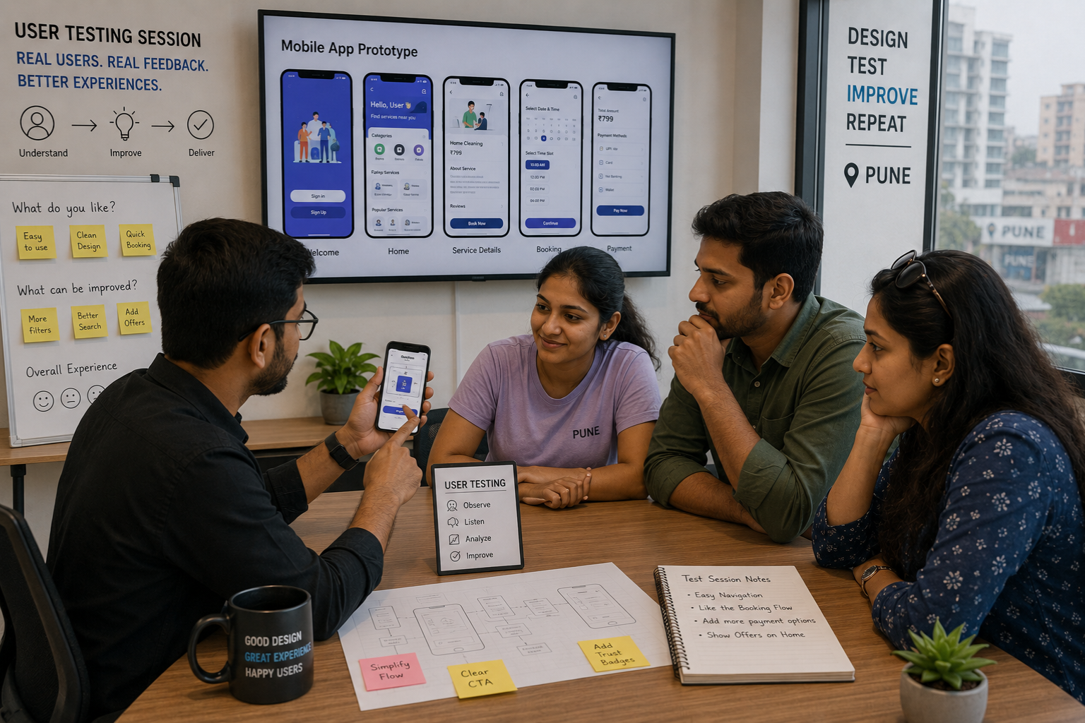
We use Hotjar and actual user testing sessions for every app we design. We watch people in Pune—real customers, not UX professionals—try to use the app. The insights are brutal and invaluable.
For a real estate app we designed, we thought our filter system was intuitive. Made perfect sense to us. Then we watched a 52-year-old property buyer try to use it. He tapped the wrong buttons, couldn’t figure out how to clear filters, got frustrated and closed the app.
We redesigned the entire filter interaction based on watching 8 users struggle. Sometimes you need to see the confusion on someone’s face to understand where your design is failing.
4. Speed beats beauty every single time
If I could hammer one thing into every business owner’s head, it’s this: a fast, simple app beats a beautiful, slow app 100% of the time.
Users in 2026 will forgive basic design. They won’t forgive lag. They won’t forgive waiting. They definitely won’t forgive spinning loaders.
We optimized an e-commerce app for a Pune client by removing half the visual elements, simplifying animations, and lazy-loading images. Did it look less impressive in screenshots? Yeah, a bit. Did conversions improve by 34%? Absolutely.
Speed is UI/UX. Responsiveness is design. If your app feels sluggish, nothing else matters.
Why This Matters More in 2026 Than It Did in 2024
Look, UI/UX has always mattered. But something’s genuinely different now.
First, AI tools have made it easier than ever to build functional apps. You can have a working prototype in days using no-code tools and AI assistance. That means functionality isn’t a differentiator anymore. Everyone’s app basically works. The question is: which one feels better to use?
Second, users have been trained by the best apps in the world. Your Pune customers use Google Pay, Swiggy, Instagram, WhatsApp. They expect every app to be that intuitive. Your app is competing against the UX standards set by billion-dollar companies. That bar is high.
Third, the app market is saturated. There are 8-10 alternatives for almost any app idea now. When we designed an appointment booking app for a salon chain in Baner, we counted 23 similar apps already on the Play Store. The only way to win isn’t better features—it’s better experience.
And fourth, word spreads faster. One user has a bad experience, they don’t just delete your app. They tell their WhatsApp group. They leave a 1-star review. They post on Reddit. Bad UI/UX doesn’t just lose you one user—it loses you their entire network.
That’s why mobile app design companies that actually understand user psychology are more valuable than ever. You’re not just buying design services. You’re buying insurance against all these risks.
How We Approach UI/UX at Webcomp Digitex
I should probably explain how we actually do this work. Not because I want to sell you—you’ll call if you need help—but because it might help you evaluate whoever you end up working with.
We start every ui ux app development project with research, not design. We want to understand:
- Who’s actually using this app (not who you hope will use it)
- What they’re trying to accomplish
- Where and when they’ll use it
- What their current alternatives are
- What frustrates them about those alternatives
We use tools like Google Analytics 4 on existing properties, user interviews, competitor analysis in Ahrefs, and sometimes just observation. For that manufacturing app I mentioned earlier, we literally spent a day at the Chakan facility watching warehouse staff work. You can’t design for contexts you don’t understand.
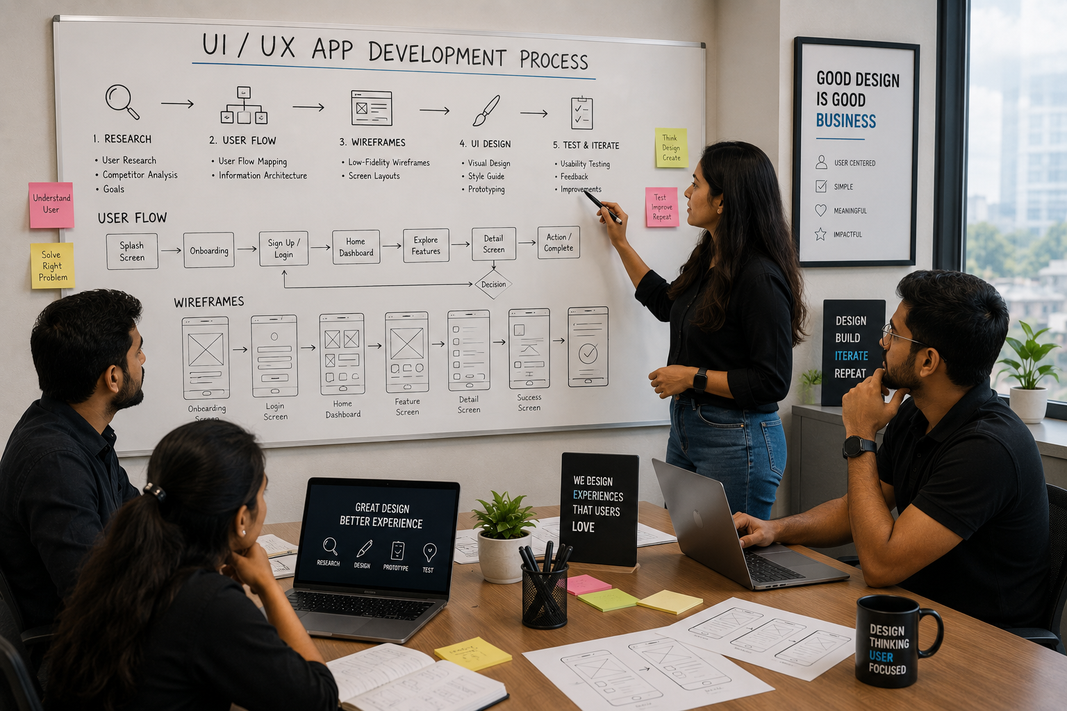
Then we map user flows before we touch any visual design. What’s the shortest path from opening the app to completing the main task? What could go wrong? Where might someone get confused?
Only after that do we start designing interfaces. We use Figma for mockups, create interactive prototypes, and test them with real users. Not our team. Actual target users.
We iterate based on what we learn. Sometimes that means killing features we thought were brilliant. Sometimes it means adding complexity in one area to simplify another.
When we move to development, our designers work alongside developers, not in a separate silo. Because a beautiful design that’s hard to build gets compromised during development. We’d rather have a buildable design that maintains the UX integrity.
After launch, we track everything in GA4 and Hotjar. Where are users dropping off? What features aren’t being used? What’s causing frustration? Then we iterate.
That’s what working with a proper web app design agency looks like. It’s not about delivering mockups. It’s about delivering results.
The Bottom Line for Pune Businesses
If you’re building an app in 2026—whether it’s for customers, employees, or partners—your UI/UX is your product.
Not part of your product. Not the wrapper around your product. It IS the product.
I’ve watched too many Pune businesses burn money on apps with great ideas and terrible execution. The functionality works, but nobody uses it. The features are powerful, but they’re hidden behind confusing interfaces. The app technically does everything it’s supposed to, but the experience makes people want to throw their phone out the window.
Don’t make that mistake.
Work with people who understand that ui ux app development is about human behaviour, not just visual design. Whether that’s Webcomp Digitex or another web application designer who actually gets it, make sure they ask about your users before they show you colour palettes.
Your app’s success isn’t determined by your code quality. It’s determined by whether someone in Hinjewadi or Kharadi or Wakad finds it easy, fast, and pleasant to use.
That’s it. That’s the whole game in 2026.
Frequently Asked Questions
What’s the difference between UI and UX in app development?
UI (User Interface) is what you see—buttons, colours, typography, icons. UX (User Experience) is how it feels to use—the flow, the logic, the ease of completing tasks. Think of UI as the steering wheel and dashboard of a car. UX is how natural it feels to drive. You need both, but honestly, I’d take great UX with okay UI over beautiful UI with confusing UX any day. A slightly ugly app that’s easy to use beats a gorgeous app that frustrates people.
How much should I budget for UI/UX design in my app project?
In Pune, for a proper job with research, testing, and iteration, you’re looking at 25-35% of your total app development budget going to UI/UX. So if you’re spending ₹12 lakhs total, expect ₹3-4 lakhs on design. I know that sounds like a lot, but it’s actually your insurance policy. Cut corners here and you’ll spend double that amount fixing it later. I’ve seen it happen literally dozens of times. The cheap option always costs more in the end.
Can’t I just use templates or copy successful apps?
You can, but you probably shouldn’t. Templates give you generic solutions, not ones tailored to your specific users and their specific needs. And copying successful apps? That app was designed for their users, their market, their context. A feature that works brilliantly for Swiggy might make zero sense for your warehouse management app. That said, learning from successful apps is smart. Just don’t clone them blindly. Understand why they made certain choices, then make choices that fit your context.
How long does good UI/UX design take?
For a typical mobile app at Webcomp Digitex, we spend 3-5 weeks on research, user flow mapping, and initial designs. Then another 2-3 weeks on iteration based on testing. So you’re looking at 5-8 weeks before development even starts. Can you do it faster? Sure, but you’ll sacrifice quality. Can you spend longer? Absolutely—complex apps with multiple user types can need 10-12 weeks of design work. The timeline depends on app complexity and how much user research is needed.
Should I hire a freelancer or a web app design agency?
Depends on your project and budget. Freelancers can be great for simple apps with straightforward requirements. They’re usually cheaper and faster. Agencies like ours make sense when you need the full package—research, multiple designers with different strengths, developers who work alongside designers, testing infrastructure, and ongoing support. I’m biased obviously, but I’d say: simple app with clear requirements and tight budget = freelancer. Complex app where failure is costly = agency. And whatever you choose, check their actual work, not just their portfolio screenshots.
What tools do professional designers use for UI/UX?
The standard toolkit right now includes Figma for interface design and prototyping, Adobe XD as an alternative, Sketch if they’re Mac-only. For research and testing, we use Hotjar for behaviour recording, Google Analytics 4 for usage data, Maze or UserTesting for user testing sessions, and Miro for collaborative mapping. Honestly though, tools matter less than thinking. I’ve seen brilliant UX work done with paper sketches and terrible work created in expensive software. The tool isn’t the skill.
How do I know if my app’s UI/UX is actually good?
Watch real users try to use it without any guidance. If they can accomplish their main task within 2-3 minutes without asking questions or getting frustrated, you’ve got good UX. Check your analytics in GA4—look at session duration, task completion rates, drop-off points. Read your user reviews honestly. Track your support tickets—if people are constantly asking “how do I…” questions, your UX has problems. And be honest about your own experience: if you find yourself making excuses for why something is confusing, it probably needs fixing.
Ready to Build an App People Actually Love Using?
Look, I get it. Reading about UI/UX is one thing. Actually figuring out how to do it for your specific business is another.
If you’re in Pune and you’re thinking about building an app—or if you’ve already got one that’s not performing the way you hoped—let’s talk. Not a sales pitch. Just a conversation about what you’re trying to achieve and whether good ui ux app development can get you there.
At Webcomp Digitex, we’ve spent over 12 years designing apps for Pune businesses. Manufacturing companies in Chakan and Pimpri-Chinchwad. Healthcare startups in Kharadi. Real estate companies in Hinjewadi and Baner. E-commerce brands across the city. We’ve seen what works and what fails, and we’re pretty honest about both.
We’re not the cheapest option. But we’re the option that saves you money by getting it right the first time.
Give us a call at +91-9960802498 or check out our work at webcompdigitex.com.
Your app doesn’t have to be another statistic in the “downloaded once and deleted” category. With the right approach to UI/UX, it can be the tool your users actually look forward to opening.
Let’s build something that works.

